
Minimalist Color Palettes to Enlarge Small Rooms
Chosen theme: Minimalist Color Palettes to Enlarge Small Rooms. Welcome to a calm, light-filled approach to design where simple, well-chosen hues visually stretch tight spaces. Explore strategies, stories, and practical tips, then share your palette experiments and subscribe for weekly small-space color inspiration.
Why Minimalist Palettes Make Rooms Feel Larger
Light Reflectance Value (LRV) Simplified
Paints with higher LRV bounce more light, brightening corners and visually pushing walls outward. Aim for LRV 70+ on walls in truly small rooms. Test swatches on multiple walls and check at morning, noon, and evening, then tell us which felt most expansive.
Undertones That Stretch Walls
Soft, balanced undertones prevent color cast that can shrink a space. Gentle greige or creamy off-white complements wood and warms north light. Cool, barely blue whites steady bright southern exposure. Share a photo, and we’ll help decode undertones that harmonize and enlarge.
Contrast Control for Visual Calm
Large jumps in contrast break the eye’s flow, making rooms feel choppy. Keep differences gentle between walls, trim, and furnishings. Try a single, airy base color with a whisper-deeper tone for depth. Comment with your contrast choices for feedback on creating seamless spaciousness.
Room-by-Room Strategies for Small Spaces
01
Living Rooms: Airy Neutrals with Soft Contrast
Use a luminous base on walls and ceiling to erase boundaries. Float furnishings in tones close to the wall shade to reduce visual clutter. A single textured throw in your accent color adds depth. Share a sofa photo, and we’ll suggest a matching neutral.
02
Bedrooms: Restful Monochromes
Choose a monochrome scheme—one color, varied by a step or two—to soothe and expand. Bed linens, curtains, and rugs should echo the wall’s undertone. Avoid dark headboards that anchor heavily. Post your undertone question; we’ll advise whether warm or cool helps your light.
03
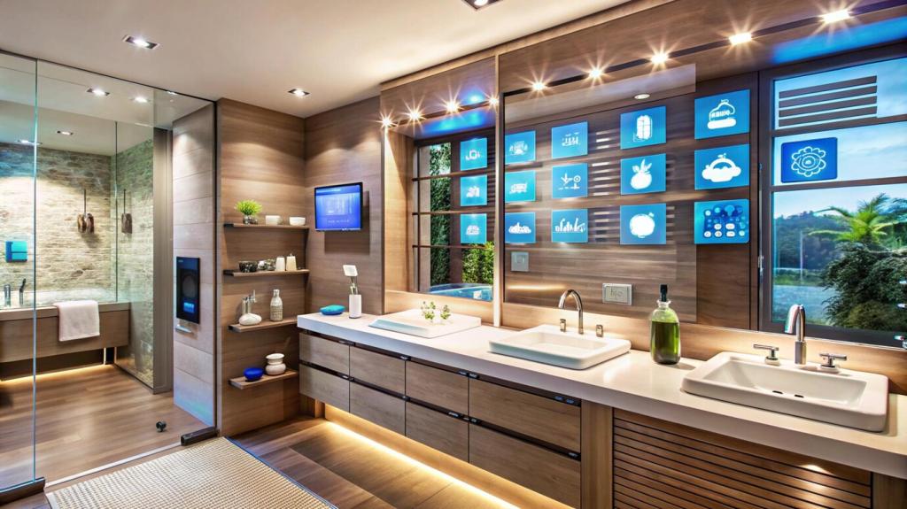
Kitchens and Baths: Crisp Light with Warm Touches
High-LRV cabinets paired with a slightly warmer wall tint feel inviting yet bright. Keep backsplash patterns quiet, focusing on grout matching tile tone. Use your accent sparingly on towels or canisters. Upload a snapshot, and we’ll refine tile, paint, and hardware harmony.
Ceilings, Trim, and Doors: The Edges That Expand
Paint the ceiling the same color as the walls but lightened by 10–20% to eliminate horizon lines. This subtle shift encourages the eye to read height, not edges. Report back on your percentage tests, and we’ll help adjust for your room’s light level.

Ceilings, Trim, and Doors: The Edges That Expand
Match trim to wall color in the same finish family for a near-invisible boundary. The room instantly feels wider because the frame disappears. If durability is a concern, choose satin for trim in the identical color. Ask us about finish pairings for busy hallways.
Texture, Light, and Materials Within Minimalism
Blend fine-grain textures—linen, matte ceramics, soft wool—in tones close to your base color to add tactile interest without chaotic contrast. Avoid heavy, high-contrast patterns. Post a material board, and we’ll advise which textures enhance depth without shrinking the room’s feel.
Sheer window treatments keep daylight diffused, while layered lamps—ambient, task, accent—ensure consistent glow at night. Use warm LEDs around 2700–3000K to flatter minimalist neutrals. Tell us your window orientation, and we’ll tailor light-temperature and placement suggestions for maximum spaciousness.
Choose upholstery within two steps of the wall color and slim silhouettes with raised legs to reveal more floor. Clear or lightly stained furniture reduces color blocks. Share your sofa and rug candidates, and we’ll help coordinate tones that quietly expand your space.

A Reader’s Story: From Cramped to Calm
Sofia had charcoal walls, bright curtains, and a patterned rug competing for attention. The room felt compartmentalized and dim. She craved clarity but feared blandness. In the comments, tell us what makes your small room feel crowded—we’ll help identify the biggest visual culprit.
A Reader’s Story: From Cramped to Calm
She sampled three light neutrals with distinct undertones, observing across three days. A creamy off-white with subtle beige undertone unified her oak floors. She matched trim to walls and lightened the ceiling 15%. Share your top two samples and we’ll vote with reasons.
Common Mistakes and How to Avoid Them
Too Many Accents
Multiple accents create visual ping-pong. Limit to one gentle accent and repeat it sparingly. If you love color, try it in flowers, books, or art that can rotate. Comment with your favorite accent, and we’ll suggest calming ways to incorporate it.
Ignoring Undertones and Lighting
A white that looks crisp in the store may go green or pink in your home. Test under your actual bulbs and daylight. If shadows feel cold, consider warmer undertones. Share your lighting type, and we’ll recommend undertone families for balance.
Clutter Undermining the Palette
Even perfect colors cannot overcome visual clutter. Edit accessories, unify storage bins with your base color, and keep surfaces open. Snap your shelf, and we’ll propose a streamlined arrangement that supports your minimalist palette and restores that enlarged, breathable feeling.
Join our mailing list